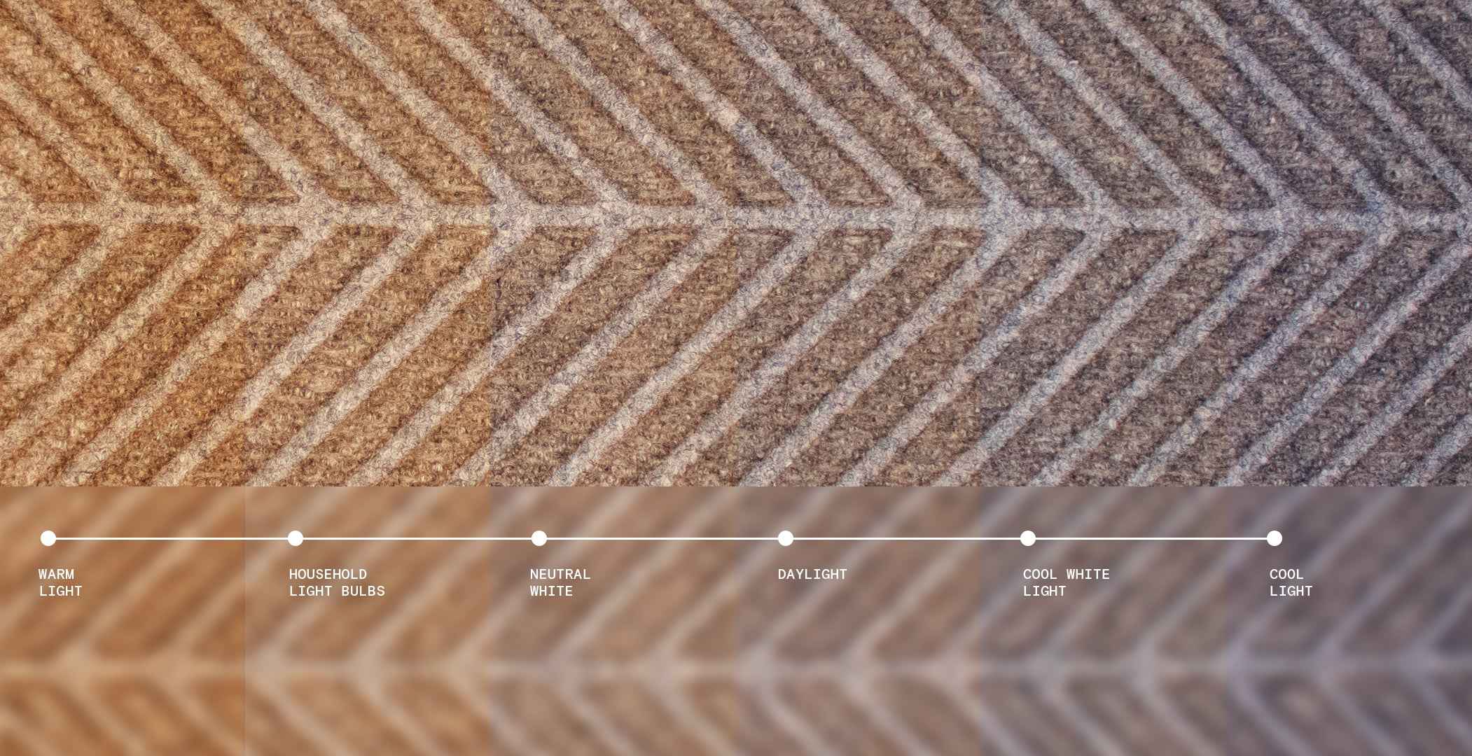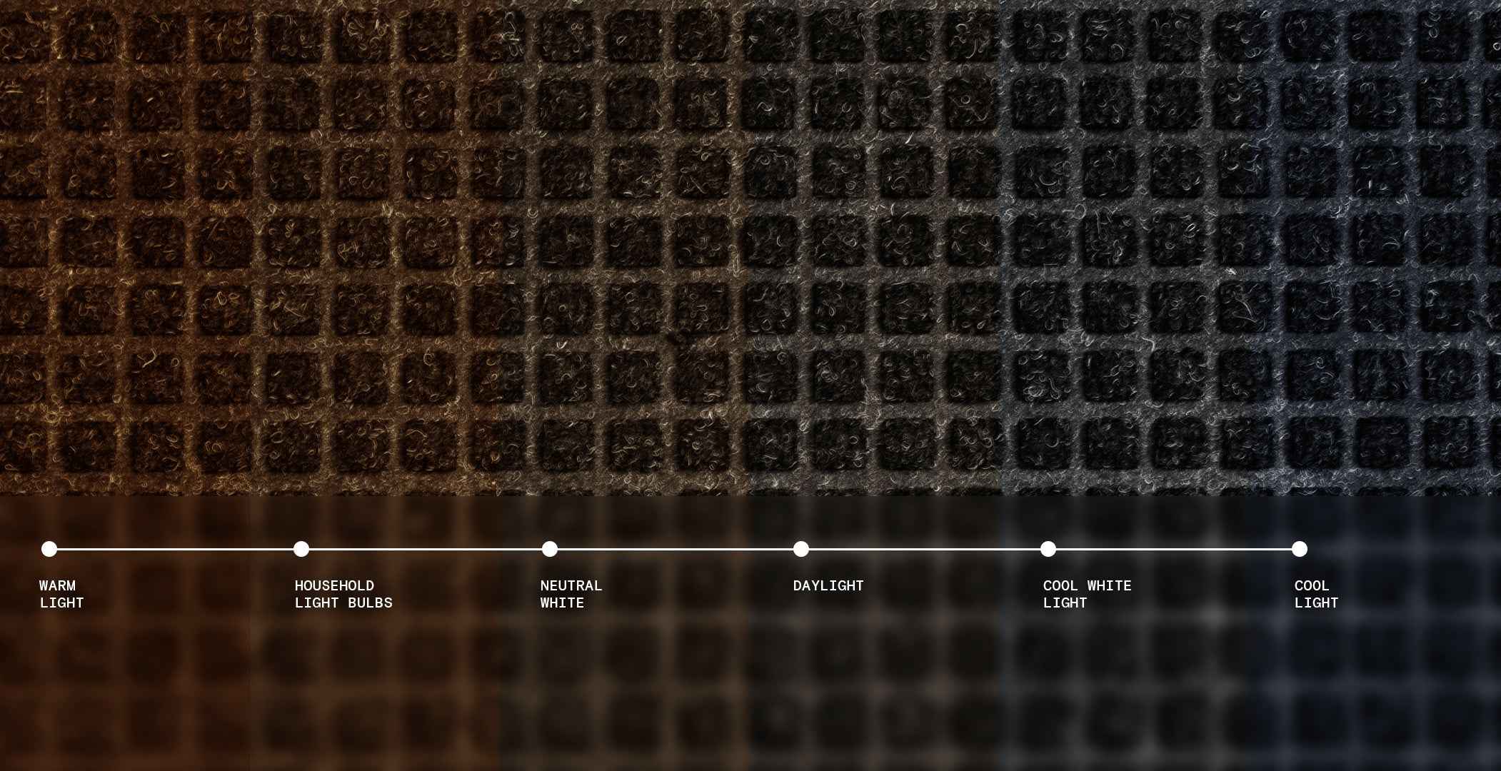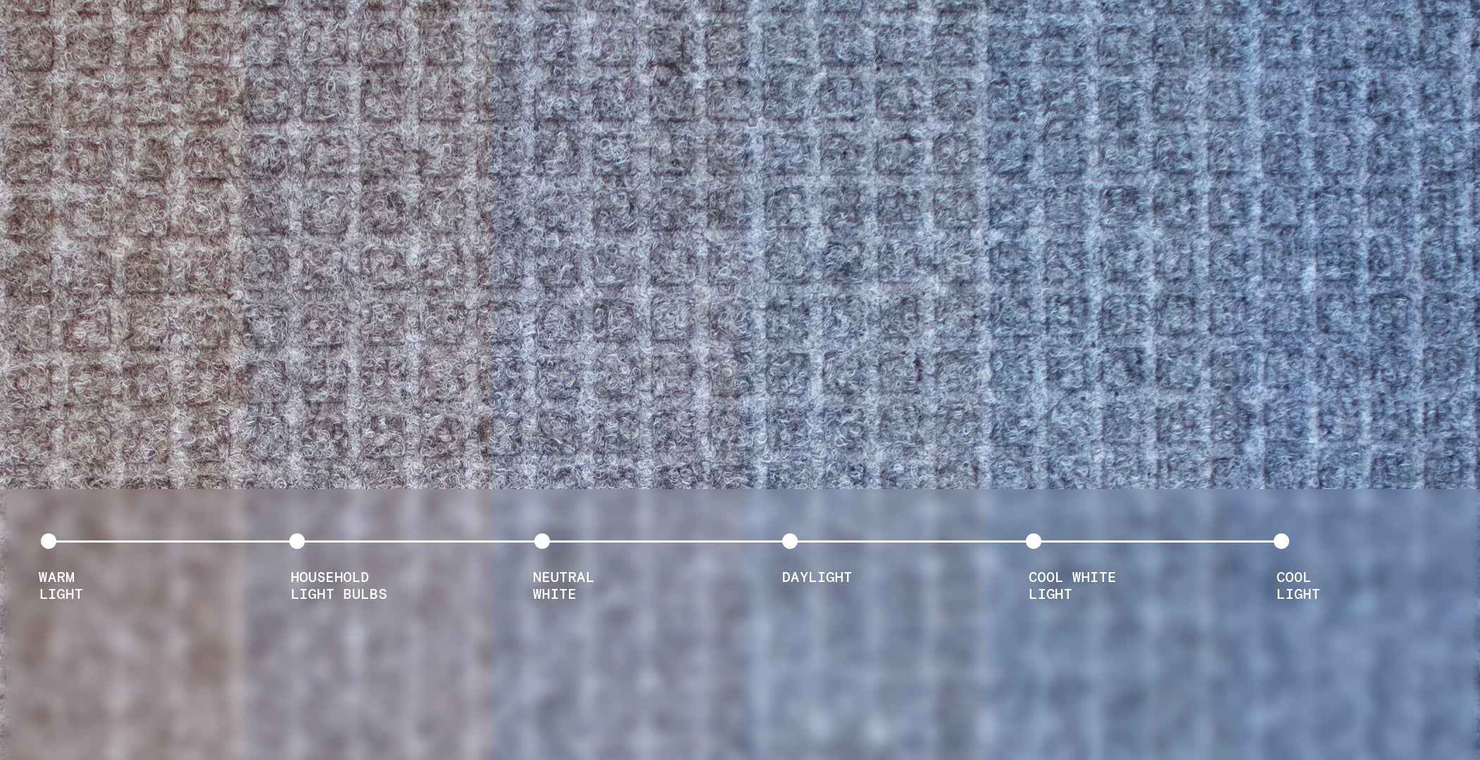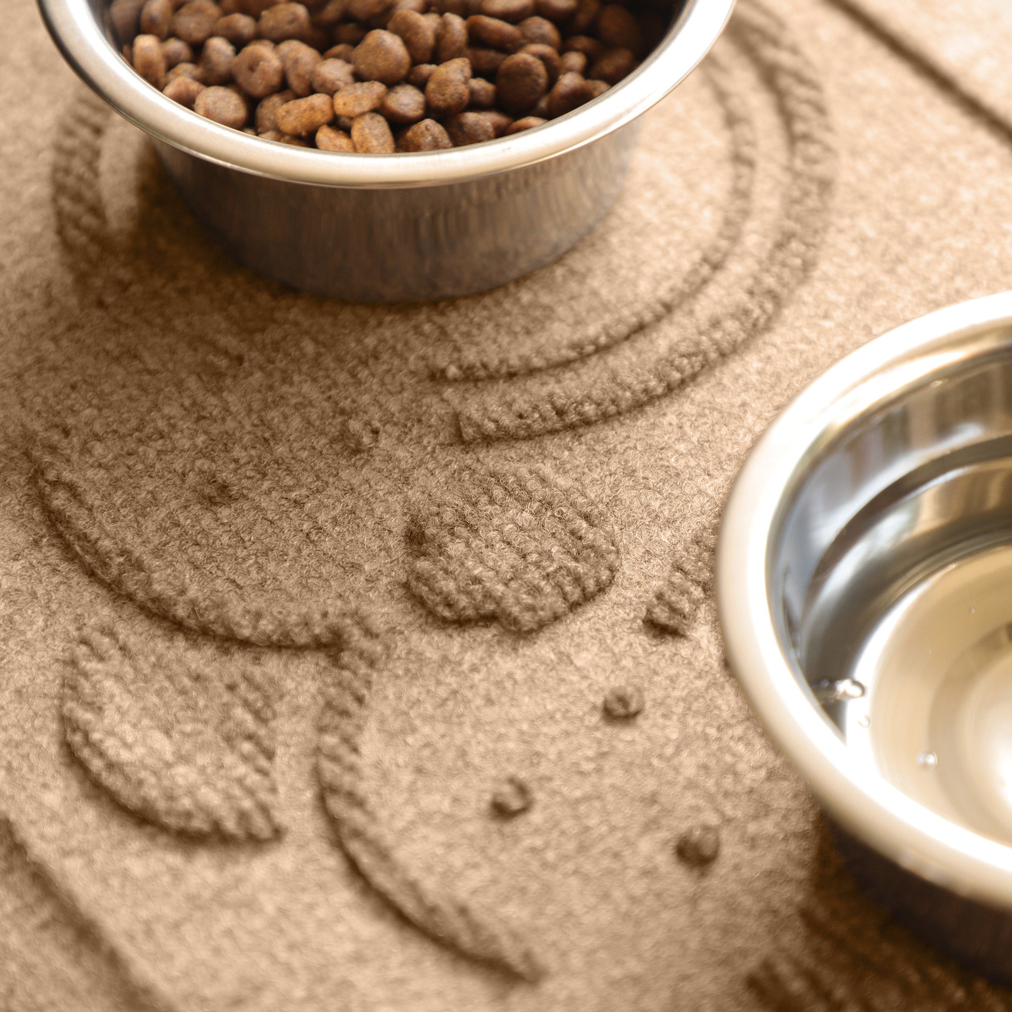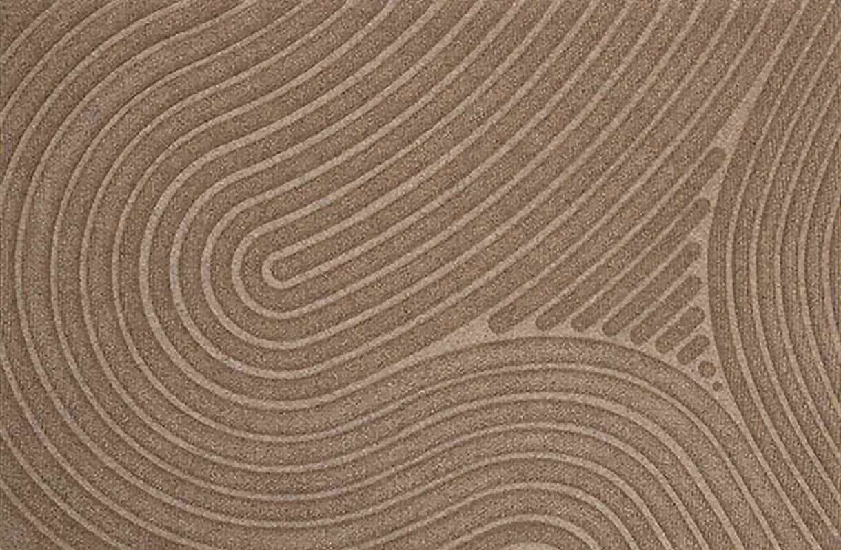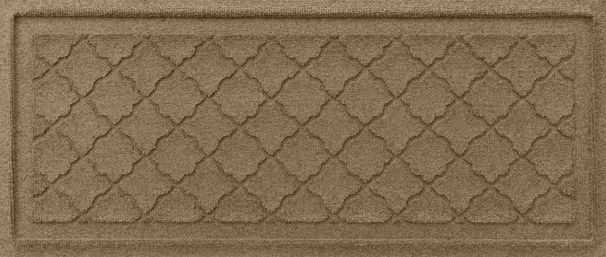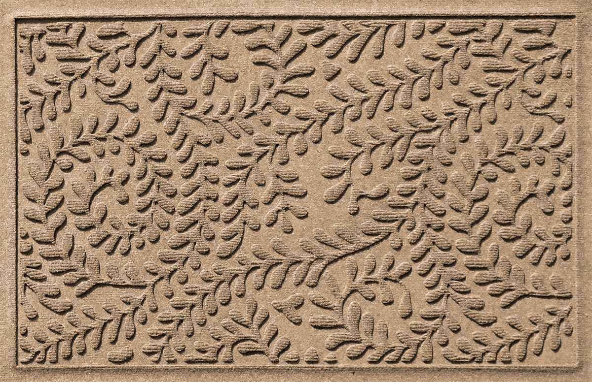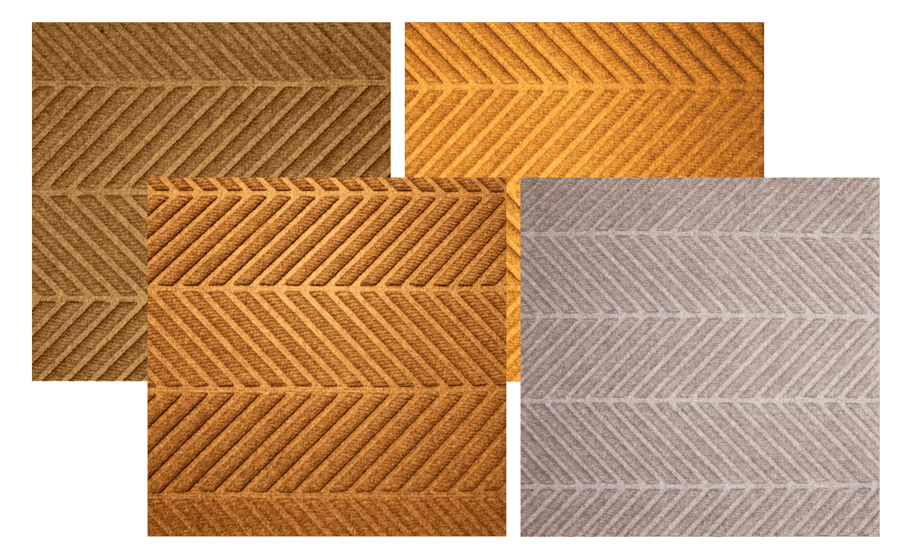
Your eyes aren't playing tricks on you, it could be your lighting.
The type of lighting in your space can make your WaterHog mat look lighter or darker and give it a blue, orange or green tint. Even the time of day or the weather can alter how your mat appears.
To show you what we mean, we've taken a camel colour WaterHog and photographed it in four common light settings. But most of times, the light will vary from household light bulbs to daylight.
How your floor affects the colour of your mat
This effect is due to the way light interacts with both the mat and the surrounding floor. Darker floors tend to make mat colours appear more vibrant, and vice versa.
Additionally, the contrast between the mat and the floor can alter how we interpret the hue and brightness of the mat. If you want the mat to stand out or blend in seamlessly with your space, it's important to consider the floor colour when choosing a mat colour for your home or business.
NEED HELP?
Frequently Asked Questions
As all our mats are designed to be stain & fade resistant, there is no bad choice. However, certain colours may have practical or aesthetic benefits, such as:
- Darker colours can hide dirt and stains better, making them ideal for high-traffic areas or outdoor use.
- Bright or light-coloured mats may need more frequent cleaning, but they can brighten up a space or create a fresh, airy look.
- Contrast: Dark mats on light floors create bold contrast, while light mats on dark floors look bright. Similar colours make the mat blend in.
- Warm vs. Cool Tones: Warm floors can dull cool mats, while cool floors enhance warm mats.
- Glossy vs. Matte: Glossy floors make colours brighter, while matte floors soften them.
- Blue: Calming, peaceful, and serene.
- Camel & Grey: Neutral and grounding, suitable for modern, minimalist spaces.
- Black: Sleek, elegant, and timeless.
At WaterHog® Mats, we carefully choose natural colours that seamlessly blend with any home. Our colour selection is both stylish and practical. We focus on shades that help conceal dirt and mess, ensuring that the mat maintains a clean, fresh appearance over time. This thoughtful approach makes our mats not only visually appealing but also easy to maintain, keeping your space looking neat and inviting.

